
About Product
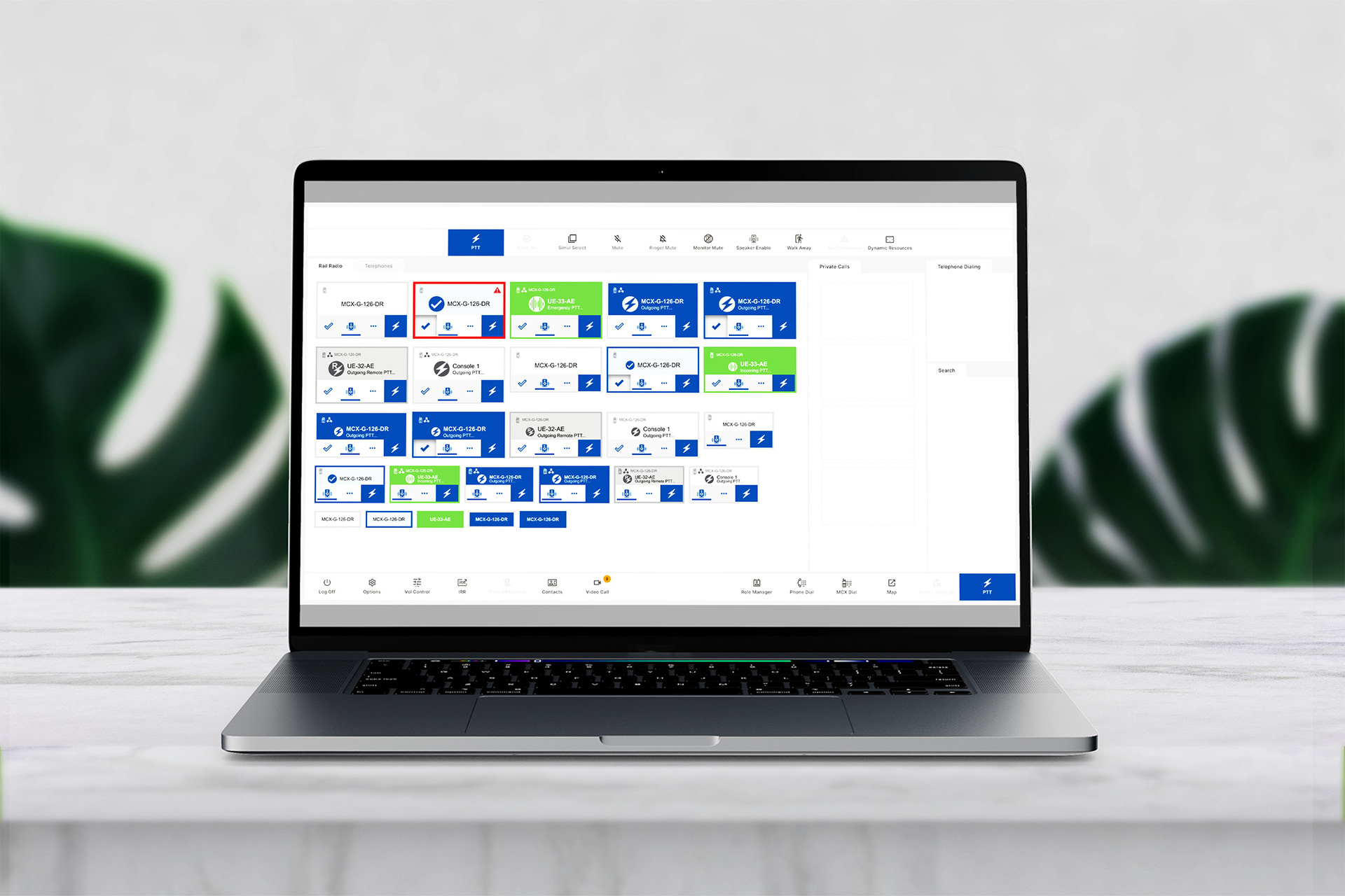
ACOM Command & Control is designed to meet the complex demands of critical communication centres throughout the world. With its combination of advanced telephony capabilities and radio integration, ACOM delivers a robust, command and control system. ACOM offers the most complete mission-critical communications solution.
------------------------------------------------------------------------------
Project Overview
This speculative UX case study explores how ACOM can increase notification trust with a simple feature. Designed as an efficient option, the feature gives users a more visible indication and how other states are exiting in comparison, balancing time/colour tone and expectations.
Challenges
1. Design an intuitive, user-focused alert experience
2. Ensures intuitive user experience with proven technical feasibility on legacy versions.
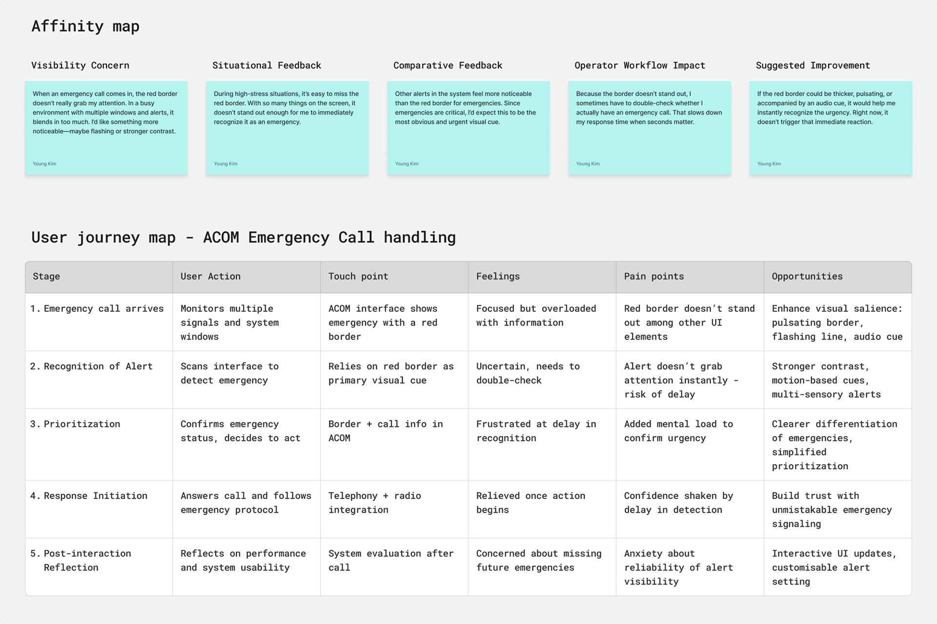
Key insights - ACOM emergency call handling
Weak Alert Visibility
The red border doesn’t stand out in a busy interface, leading to missed or delayed recognition.
Delays and Cognitive Load
Operators must double-check emergencies, slowing response and adding mental strain.
Poor Signal Priority
Other alerts sometimes feel more prominent than emergencies, reducing urgency.
Workflow Disruption
Weak cues cause frustration, slower action, and reduced confidence in the system.
Single-Sensory Limitation
Reliance on one visual cue creates risk; opportunities exist for motion, audio, and customisation.
Operator Anxiety
Users worry about missing emergencies, highlighting the need to build trust in alerts.
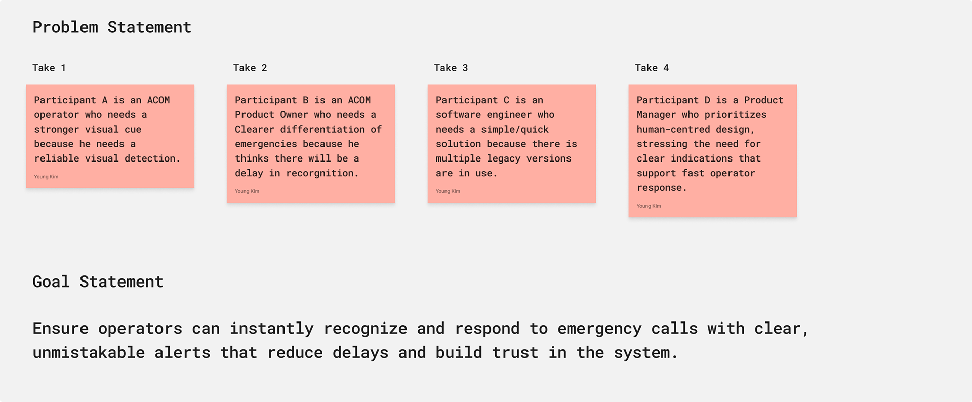
Definition
Emergency alerts in ACOM must be unmistakable, multi-sensory signals that cut through visual noise and ensure instant recognition.
1. Instant recognition
2. Clear, unmistakable alerts
Discovery
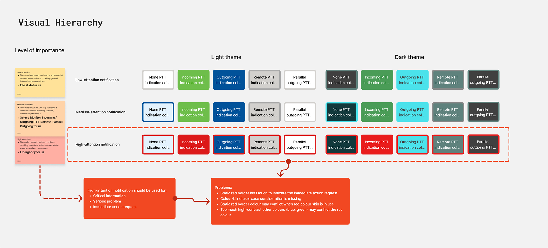
Visual Hierarchy and Critical Colour Audit
This exercise mapped the colour usage for notifications across Light and Dark themes to establish a clear Visual Hierarchy (Low, Medium, High Attention). It identified an urgent problem with the High-attention colour (red): the current implementation is insufficient for communicating immediate action requests.
It presents potential accessibility issues (colour blindness and skin tone conflict). The findings necessitate an immediate revision to the design of the critical notification system.
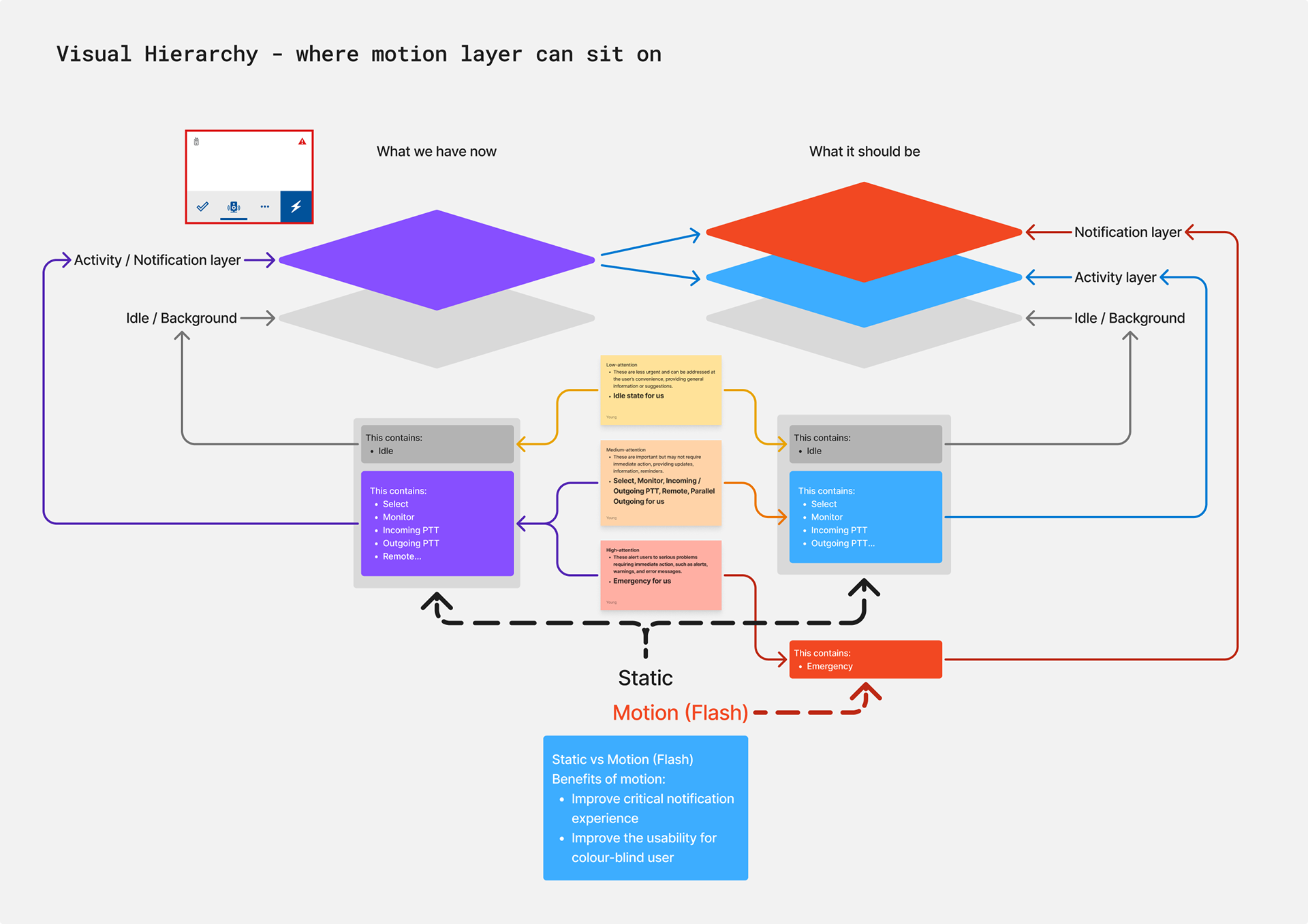
Ideation - Improving Critical Alert Recognition with Motion-Based Hierarchy
Motion Layering for Emergency Notifications
This exercise analyses the current vs. proposed Visual Hierarchy stack to determine where a motion-based (Flashing) notification layer should sit.
The current design conflates background and notification states, leading to poor visibility for critical alerts. The proposed solution separates the stack into distinct Notification, Activity, and Idle layers, dedicating a separate Static/Motion (Flash) layer exclusively for Emergency states.
The benefit is explicitly to improve the critical notification experience and enhance usability for color-blind users by using motion as a secondary indicator.
Opportunity
Motion Layering and Visibility Conflict
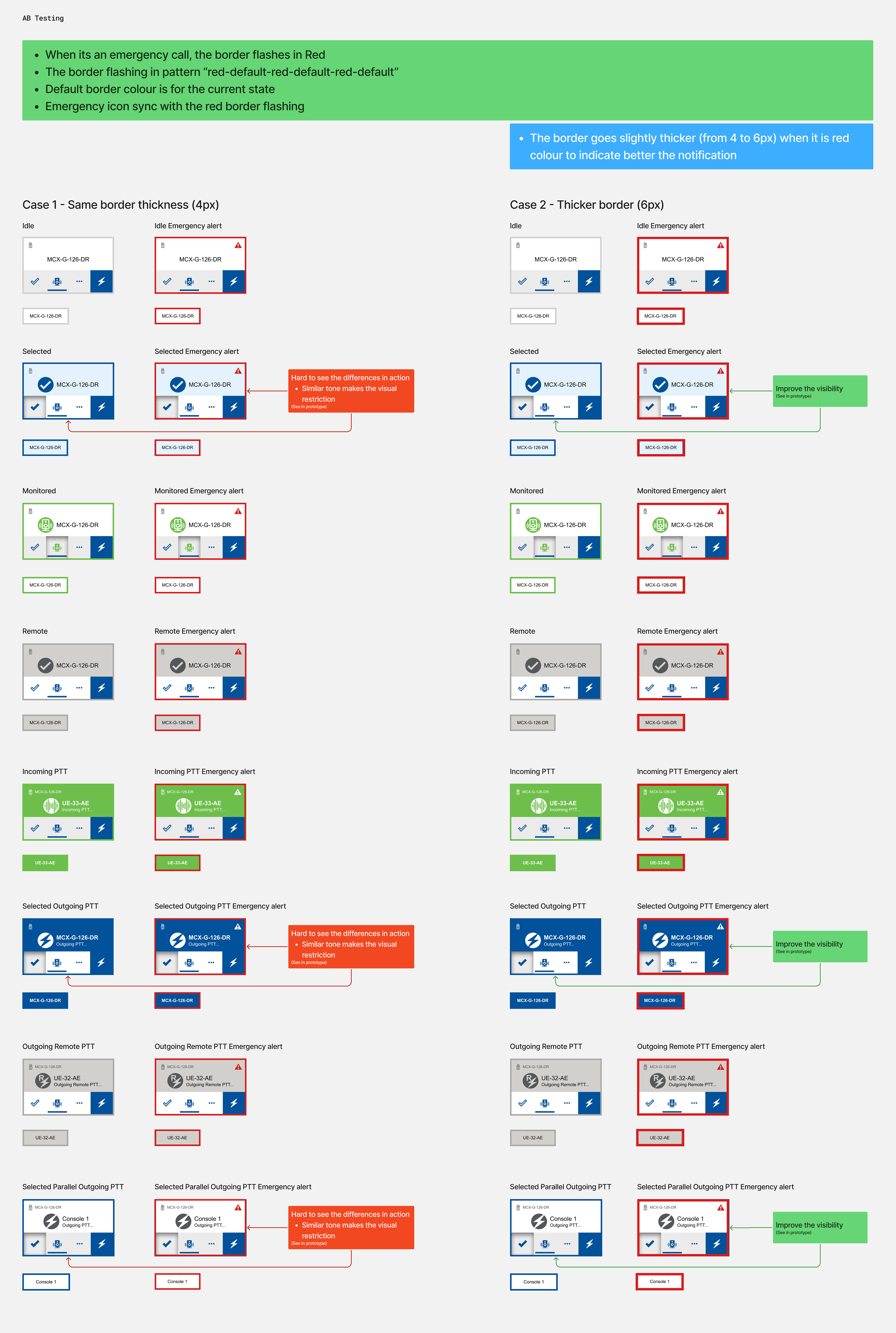
This stage explored utilising a flashing border (motion layer) as a distinct, secondary indicator for critical or high-attention states. The intent was to enhance visibility and improve the experience for color-blind users by introducing an interval-based flash (e.g., Flash-Default-Flash).
However, testing revealed a visual restriction: when the default colour of the element's border (such as the blue used for 'Select' or 'Outgoing PTT') shares a similar tone or low contrast with the flashing colour, the motion effect is significantly diminished. This visual conflict compromises the effectiveness of the flashing alert, requiring a revised motion solution to ensure immediate user notification across all primary states.
Iteration
Finalised Motion Alert Implementation: Thickness and Timing
This phase finalised the motion-based notification solution designed to overcome previous visibility conflicts (especially for color-blind users). Through iterative design and engineering collaboration, the team validated the optimal visual parameters:
Border Thickness: The critical alert border was increased from 4px to a maximum of 6px, which user testing confirmed offers the best visual indication.
Motion Effect: The effect was implemented as a clear "bumping" motion by transitioning the border thickness from 6px down to 0px.
Interval Timing: The flashing interval was precisely set at 0.3 seconds per flash in collaboration with the engineer to ensure reliable performance.
AB Testing
Flashing-border prototype
Following the completion of the high-fidelity prototype, a usability study was conducted with five participants to validate core interactions and performance.
Usability study
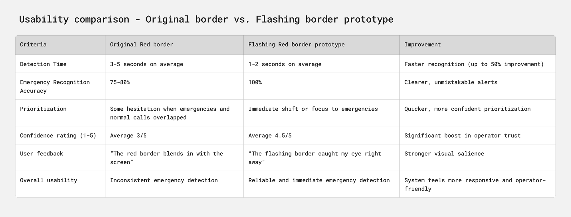
The flashing red border prototype greatly improved usability by reducing emergency detection time from 3–5 seconds to 1–2 seconds, achieving 100% recognition accuracy, and enabling operators to prioritise emergencies immediately.
Participants reported higher confidence and trust in the system (4.5/5 vs. 3/5), noting the alert was clear, eye-catching, and reliable.
Objective
To evaluate whether the redesigned flashing red border improves the operator’s ability to detect and respond to emergency calls compared to the original static red border.
Methodology
Format: Moderated usability sessions
Participants: 5 operators (mix of experience levels)
Scenario: Simulated command centre tasks with a mix of normal and emergency calls.
Prototype: Figma interface updated with a flashing red border around emergency calls.
Tasks
Monitor multiple calls and identify emergencies when they appear
Distinguish between normal and emergency calls
Prioritise and respond to an emergency call alongside routine activity
Reflect on confidence in noticing and handling emergencies
Findings
Detection: All participants noticed emergencies within 1-2 seconds (improvement from 3-5 seconds previously)
Recognition: 100% accuracy in distinguishing emergencies from normal calls.
Prioritisation: Operators immediately shifted focus to emergencies without hesitation.
Confidence: Participants rated system reliability higher (average 4.5/5, up from 3/5)
User-feedback
“The flashing border immediately caught my eye”
“I didn’t have to scan for it. It stood out right away”
“I feel confident I won’t miss an emergency now”
Conclusion
The flashing red border significantly increased usability by reducing detection time, improving recognition accuracy, and boosting operator confidence. This design change directly supports faster emergency response and stronger trust in the system.
-------------------------------------------------------------------------------
Design constraints and tradeoffs
While conceptually simple, this feature presents further complexity. Alarm sound synchronisation.
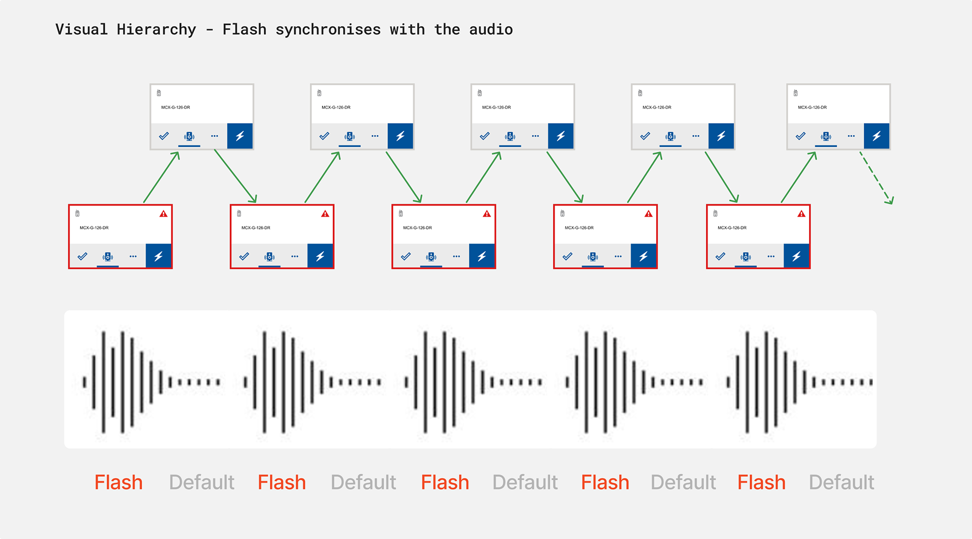
Edge case study
Alarm-Flash Synchronisation
In some scenarios, ACOM functions as a sub-product and may be positioned away from the operator’s primary line of sight, making visual alerts less noticeable.
To address this, ACOM enhances emergency detection by synchronising the alarm sound with the flashing border of the resource panel. This multi-sensory cue ensures that even if the panel is not in view, operators are still immediately alerted through both audio and visual signals, reducing the risk of missed emergencies.
Trade-off: However, due to technical feasibility challenges and task complexity, this feature has been moved to the next development phase for further refinement.
--------------------------------------------------------------------------------
Business impact
Implementing a flashing border with incremental thickness delivers measurable benefits across the user and business experience:
Customer Satisfaction – Provides clear, unmistakable alerts that set accurate expectations and build stronger trust.
Personalisation – Adapts to user needs and values, creating a more human-centred and responsive experience.
Operational Fit – Seamlessly integrates with existing features and workflows, ensuring minimal disruption and high adoption.
Final takeaways
This project showed how small changes in notifications can unlock large shifts in trust and satisfaction. It’s not just about 'Flashing' — it’s about making the user feel seen, heard, and understood.
The smartest solution isn’t always the complex. It’s the one that aligns with your intent.